Chris Ryder (art director), Brian Fletcher (associate art director), Ben Hutchings (associate lightning director), Matt McDaid (lead exterior environment artist), and Chaz Head (lead props and interactives artist) share how they approach each of the distinct areas in Diablo IV and how they come together to form the immersive environment art.
Bring the popcorn and a few drinks. There are 7 YouTube videos showcasing different locations of Sanctuary and several screenshots.
The darkest and most grounded of the series, Diablo IV strives for believability over realism in its environments. To do this, the team has established two foundational pillars to filter concepts, locations, and implementation: “old masters” and “a return to darkness”. Using these pillars, the environment has been created with a controlled use of detail and color palettes to give a distinct visual style. Weather and physically based lighting also play a larger role in creating the dangerous world of Sanctuary and allowing the atmosphere to feel more tangible.
For the first time in the series, Diablo IV features a shared open world with 5 captivating zones to explore. From the Dry Steppes to the Scosglen coast to the glacial ridges, each area has been carefully handcrafted by the Diablo Art and Design teams. Dynamic props populate many of these areas to breath a sense of life into the architecture and terrain. Interactable and breakable props frequent many environments as the team has pushed themselves to create realistic and variable destruction.
Diablo IV also features over 150 randomized dungeons utilizing a combination of handcrafted and procedural creation. To make dungeon creation effective and flexible, the team set out to create a variety of tile-sets that could be cleverly reused and paired with different props, interactives, and lighting. To give tile-sets a natural feel, the tile-set transition scenes were created as a new feature to seamlessly transition between two tile-sets within the same dungeon.
Diablo IV Quarterly Update Environment Art (March 2022)
Hello and welcome to the first Diablo IV Quarterly Update of 2022. We hope you enjoyed last quarter’s update on systems, itemization, and visual effects. That blog and our previous updates are available if you missed out.
I’m struck by how much the game has evolved since our first blogs. It’s difficult for these updates to showcase all the work our engineers, designers, artists, QA team, and producers have done–how do you show a bug that doesn’t happen anymore, or explain how the planning in a burn-down chart resulted in a feature making it into the game instead of getting cut? While you can’t see those things, you can see how systems like itemization and skill trees have evolved, incorporating your feedback and internal testing along the way. You can also see how much closer we’re getting to our artistic and thematic targets of dark, low-fantasy gothic horror. And keep in mind the images you’ll see today still represent a work in progress!
Many artists need to work together to deliver Diablo IV with the top-tier visual quality we can be proud of and the promise of an immersive world you can wander through and enjoy getting lost in. The seamless game you play is a composition of many layers of art and visualization, from lighting, to environments, to props and interactives. Today we have artists from many of these layers here to talk about their craft and everything that goes into building the world of Sanctuary.
We hope you enjoy this update and look forward to your thoughts and reactions. We have exciting things to share this year, and we’re grateful to have you with us on this journey.
Thank you for playing the games we make, and without further ado, artists!
-Joe Shely,
Game Director, Diablo IV
Chris Ryder,
Art Director, Environments Diablo IV
The team has been hard at work, and we’re excited to take you behind the scenes on how we’ve developed the environments of Diablo IV. You will hear from our Associate Art Director, Environments, Brian Fletcher; Associate Lighting Director, Ben Hutchings; Lead Exterior Environment Artist, Matt McDaid; and Lead Props and Interactives Artist, Chaz Head. They will be sharing how they approach each of their distinct areas that ultimately come together to form the environment art of Diablo IV. While many of the locations we will be sharing are in various states of progress, this is an excellent opportunity to showcase the amazing work our teams are creating for the next installment of Diablo.
The environments of Diablo IV cover a lot of territory and visual real estate of the game: five distinct regions and hundreds of dungeons that you will experience. It is where all the monster-slaying, loot gathering, and exploration happens. Of course, none of this would be possible without the collective efforts of our talented designers, worldbuilders, engineers, environment artists, lighting artists, and technical artists.
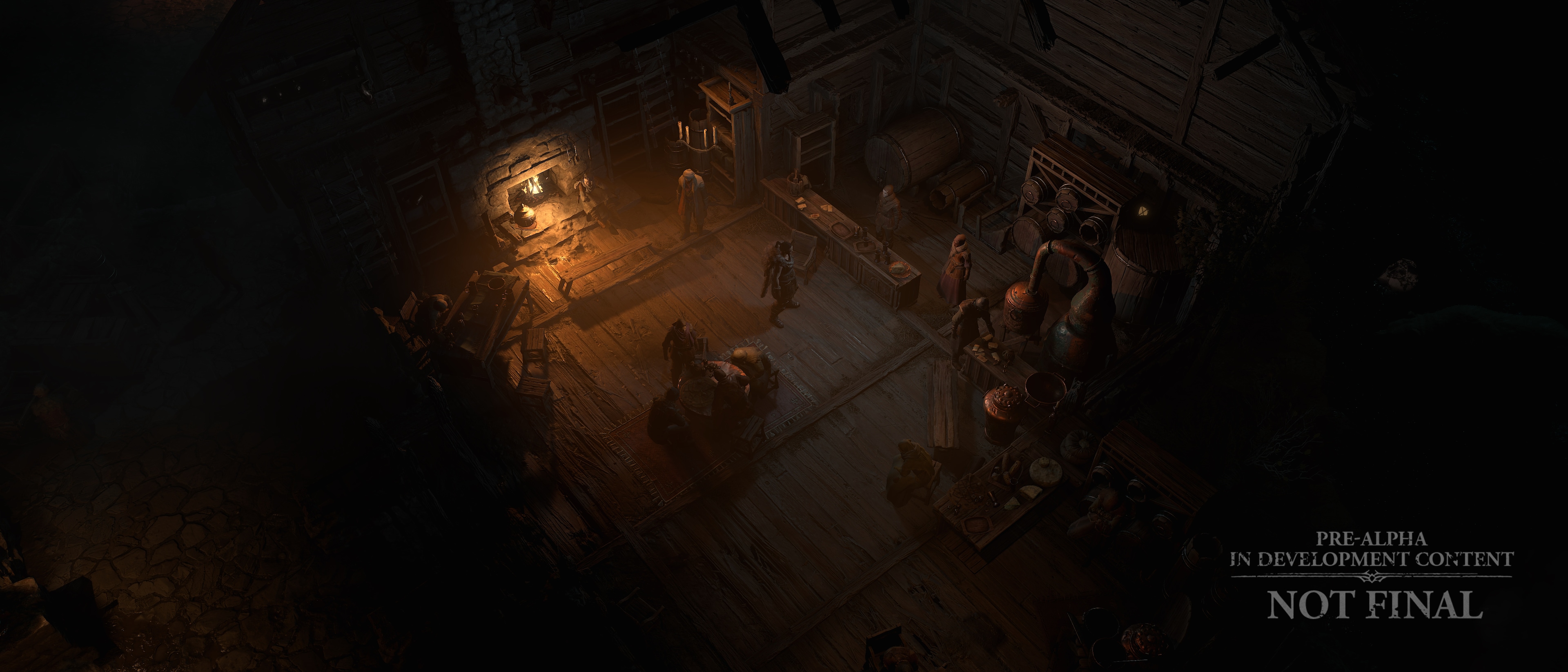
We approach creating the environments of Diablo IV through a darker and more grounded interpretation than earlier installments. The aim is for believability, not realism. Believability comes through our use of materials and deliberate construction of architecture and artifacts you will come across as you play through dungeons and the open world. In addition, regional weather conditions, varied local biomes, and a sense of history set the foundation of how an object or place should look visually in a medieval world like Sanctuary. After all, Sanctuary is full of history, struggle, and conflict, giving us many opportunities to depict a diverse world full of compelling locations in a dark gothic-medieval setting. Even the wealthiest areas in Sanctuary are challenging to exist in. Leaning into these characteristics adds to the richness of the world. It gives us a springboard to elaborate on the space visually, giving it a sense of identity we can lock onto and build around. The atmosphere is almost tangible in places, with weather and lighting play a more prominent visual role in Diablo IV. When it rains, surfaces get wet, puddles form in ruts and hoof prints, the ground feels muddy, the atmosphere is heavy and damp. Contrast that by making your way into a hazy fire-lit tavern that instantly contrasts with the atmosphere outside, a rare place of refuge and warmth. We want to take you on a journey, hinting at a location’s past or recent events. The satisfying part of our work is developing and jamming on a location’s unique visual story, pushing and pulling the art until it becomes an iconic backdrop for combat, exploration finally screams Diablo.
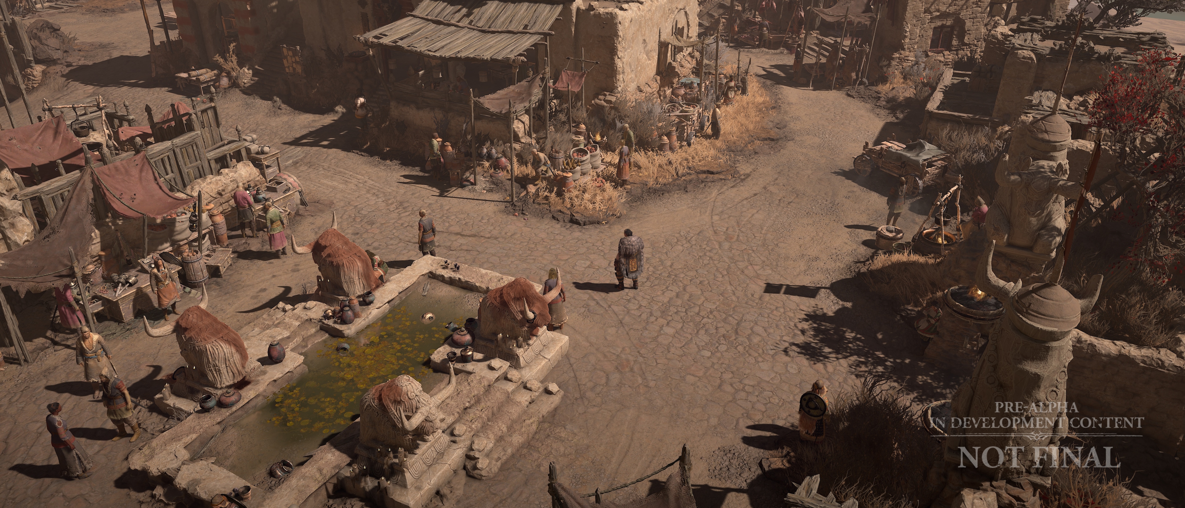
A town set in an arid location feels visibly parched, dust blowing, the color pallet plays into warm, oxidized hues to create an iconic region in the world of Sanctuary.
Diablo IV’s art is built with modern techniques and utilizes physically-based lighting. As we handcraft locations across the Eastern Continent, we are mindful of our approach to support combat, navigation, narrative intent, and stylistic direction. To accomplish this, we filter concepts, locations, and final implementation through the dual pillars of “old masters” and “a return to darkness.” Using these pillars has been instrumental in keeping us consistent and aligned with the visual tone of Diablo IV. The “old masters” pillar gives us a lens to filter our art through, considering the techniques classical painters like Rembrandt used, with their controlled use of detail, tonal range, and expert use of color palettes. The “return to darkness” pillar is a through-line in everything from dungeons to lighting and embodies the idea that Sanctuary is a dangerous and dark medieval gothic world. Additionally, we play to the iconic Diablo game camera, choosing where to add or remove detail to help the readability of the gameplay space or accentuate visual interest as needed. It is a balancing act that results in a handcrafted look with a distinct visual style that expands on the lineage of Diablo.
It is exciting and inspiring to see the daily progress and hard work the environment art teams are creating. Let’s jump into more specifics and hear from Brian, Ben, Matt, and Chaz on six locations we feel illustrate our approach and the concepts we keep top of mind when building the environments of Diablo IV.
The World of Sanctuary
Matt McDaid: “I’m excited to talk about the Open World of Diablo IV! We have 5 captivating zones to explore. Each region is fraught with dangers of their own kind. Many routes, and hidden corners to uncover. How you chose to make your way through this vast world is up to you. The Art and Design teams have constructed a contiguous world where you can roam from coast to coast, or high up into the glacial ridges. For the Environment Art team, we want to ensure each handcrafted location is distinct and immersive. Looking through the Diablo IV lens that Chris alluded to earlier, the Environment Art, Interactives, and Lighting teams strive to hit the tone that supports the ’return to darkness’ pillar.
Scosglen Coast
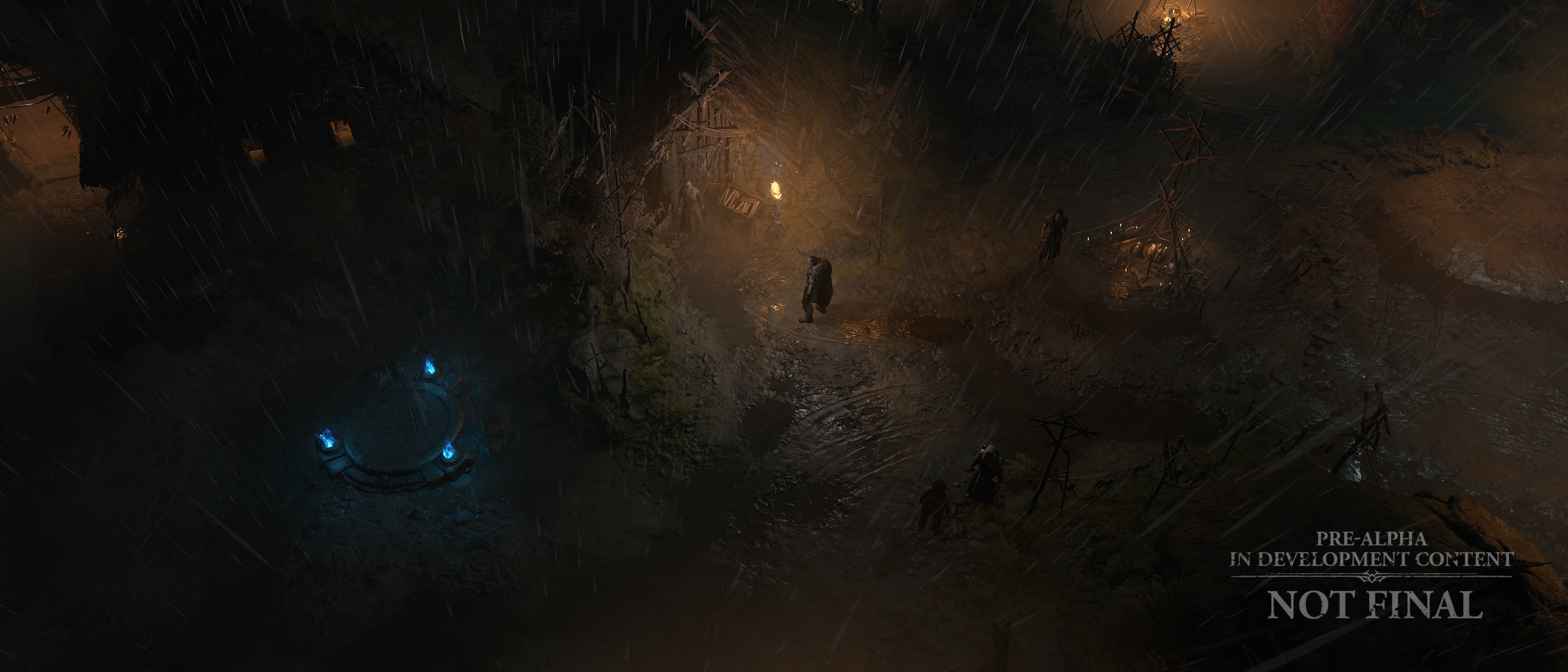
Matt McDaid: For the Scosglen coast the Environment Art team set out to tell the story of untamed, wild shorelines and headlands.As you transition toward the shores from inland, the coastal biome is first evidenced by the longer, more directional grasses that react to the driving offshore winds. The beaches are bleak and littered with seaweed, kelp and rotting carcasses. Rugged clifftops ascend high whilst promontories are carved by the continual pounding of waves below. Through the process of creating our biomes, the Environment Art team has set out to communicate that this coastline is rife with peril.
For the main settlements along the coast, it is important to us that they feel woven deep into the fabric of the coastline. Dwellings with deep-rooted foundations skirt the clifftops. In a futile attempt to withstand the harsh elements, these structures are comprised of whatever materials the locals could lay their hands on and are in various forms of disrepair. Stone walls, salvaged wood, and thatch for the roofs. A place of consolation for the brave fishermen that trawl these treacherous seas.
Fishing plays a significant part in the day-to-day life of these weary locals, so we’ve latched on to that idea and placed emphasis on these villages being centered around fishing. By adding supporting elements like rudimentary docks and slipways, it really helps set the stage for the Interactives team to come in and layer on their culture kit throughout the area.
Chaz Head: Many of the props here are dynamic. The ships swaying in the ocean waves, the fish mongers’ nets hanging to dry in the marketplace. Our main purpose here is to breathe life into the awesome architecture and terrain work. Our props and culture kits help provide that tangible real-world scale that the Diablo world represents.
The Drowned culture kit here is all interactable or breakable. When we set up these props, we push ourselves in terms of destruction. We use a constraint system to hinge specific pieces together. This allows us to orchestrate distinct, realistic and variable types of destruction.
We do our best to tell the story of what has happened here. The drowned dredging with them hoards from beneath the sea, littering their conquest with relics of long-lost cultures as they raid across the beaches of Sanctuary.
Ben Hutchings: As you explore Diablo 4’s open world you’ll experience a lot of variation in the lighting and weather – here in the Scosglen coast you can see the foggy, frigid atmosphere taking cues from highlands and moors. Across the game we’re striving for a grounded and natural palette,allowing us to create visual space for gameplay that also achieves a gritty tone suiting the world of Sanctuary.
Orbei Monastery
Matt McDaid: The Orbei Monastery is an isolated and secretive feature in the rural Dry Steppes. While the Zakarum’s presence has diminished, the Orbei Monastery carries evidence that places of worship for the Zakarum can still quietly function. Since the location here is in the desiccated plains of the Dry Steppes, we aim to push the notion of dusty grasslands with sparse vegetation. We’ve made the conscious decision to add dark rocks that complement the pale blonde and rusty grasses. Poplar and Saxaul trees cling to the ground which really helps provide parallax movement on screen. This contributes to greater depth as elements in the foreground move quicker than those further back in the scene.
To help provide extra visual interest in the region, the Environment Art team created a Salt flats biome. Being able to have blue alkaline lakes skirted with salt-encrusted tufas, and vivid geothermal pools really helps add pockets of vibrancy to the Dry Steppes and create compelling natural landmarks.
Against the efforts of the Zakarum worshipers, and like many of the buildings in Sanctuary, the Orbei Monastery is in a state of dilapidation. It is a goal of ours to visually communicate that whilst this place is in the early stages of ruin, it was once a prominent base of learning for the Zakarum monks. Compared to the native architecture in the Dry Steppes, the Zakarum architecture is more distinct and refined. These structures are adorned with ornate details, and often accompanied by elaborate statuary. Chaz will elaborate more on the interesting relics that can be found on the Zakarum estates.
Chaz Head: Many followers of Zakarum come to pilgrimage in Orbei Monastery. Caravans along the road reinforce this idea; making these wagons explode is always a fun time!
As you can see it has fallen on hard times. Much of the storage and keep-sakes of the Zakarum have been laid to waste. You can pick through the ruins of the abandoned monastery, perhaps there are still treasures to find?
As you venture outside the monastery into the geothermal region, many of its natural inhabitants to contend with. If you look closely, you will find their dwellings among the cliffs.
Kyovashad
Matt McDaid: Our goal with Kyovashad is to really drive home the idea that this medieval settlement feels oppressive, frigid, and harsh. However, we still need to convey that this is a place of refuge afforded to those who reside within its boundaries. This is a militaristic settlement, so it is important that we give it a heavily defended presence straight off the bat. We believe it appropriate to provide a gradual buildup of smaller defense structures upon approach to the settlement. Doing this hints to you that something greater lies ahead. Upon reaching the gates you are confronted with steep stone, perimeter walls and a deep cavernous moat that wards off any unwelcoming visitors.
Upon entering the town, you see the architecture typical throughout Fractured Peaks. Making use of the wood from the many forests in the region, structures here are clad with natural pine boards and birch shingles. As with most dwellings in Sanctuary these buildings are very much function over form.
In the video we can see a large portion of the southern end of Kyovashad, which contains the simplest of shelters. Some clinging to the town walls overlooking the glacial flow beneath. When you happen upon this area, we want you to draw similarities with slum-type encampments where densely packed living quarters are in abundance. The interactives team has done a fantastic job of really driving home that narrative with their culture pass.
Chaz Head: Kyovashad has many districts, with each one set dressed in unique culture kits. Here we have the slums where the downtrodden seek shelter from the extreme elements: we support this idea by layering details of frayed cloth, broken shelters, and general unhappiness. Can you believe this is an example of high-end living in Sanctuary?
Ben Hutchings: For this nighttime look at Kyovashad we can see the use of fog, soft shadows and bounce lighting to create a softness to the lighting. This softness is a core part of Diablo 4’s lighting aesthetic – providing a natural and grounded frame.
We aim to give Kyovashad a thick and lived-in atmosphere with warm and earthy tones, giving it a sense of reprieve from Fractured Peaks cooler, frigid palette.
Dungeons of Sanctuary
Brian Fletcher: Dungeons are still that randomized content that you know and love from previous Diablo titles. However, we added new and exciting features that allow us to make even more dungeons across the world of Sanctuary than ever before. In order to support over 150+ dungeons, we’ve had to shift the way we make environment art so that it’s flexible enough to be used in multiple locations and not just in a single dungeon. We break it all down into what we call tile-sets. We would like to share with you a handful of our tile-sets, and a few ways we can mix and match them with props, interactives, and lighting to create dungeons that are varied, handcrafted and yet procedurally created. It takes a lot of hard work from many teams to make a Dungeon, and we are proud to show you what we have been working on.
Forgotten Places in the world
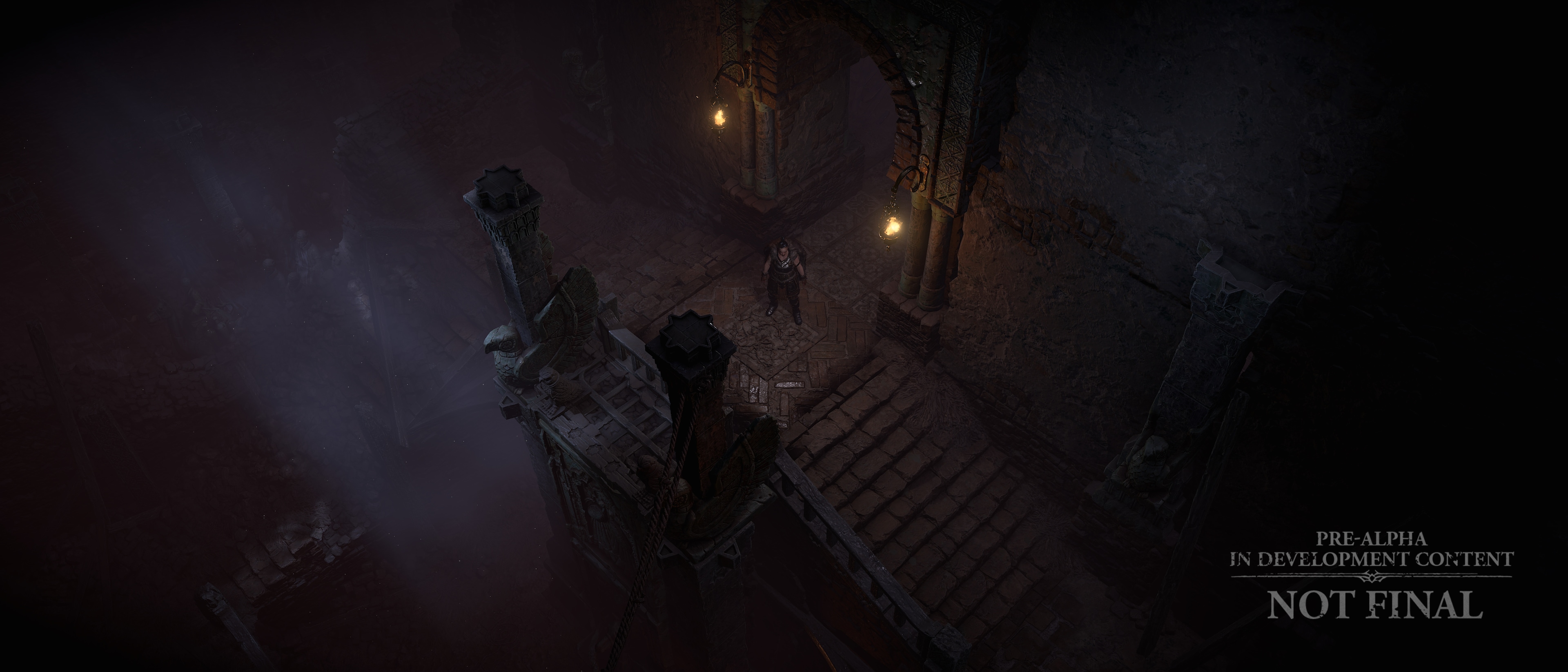
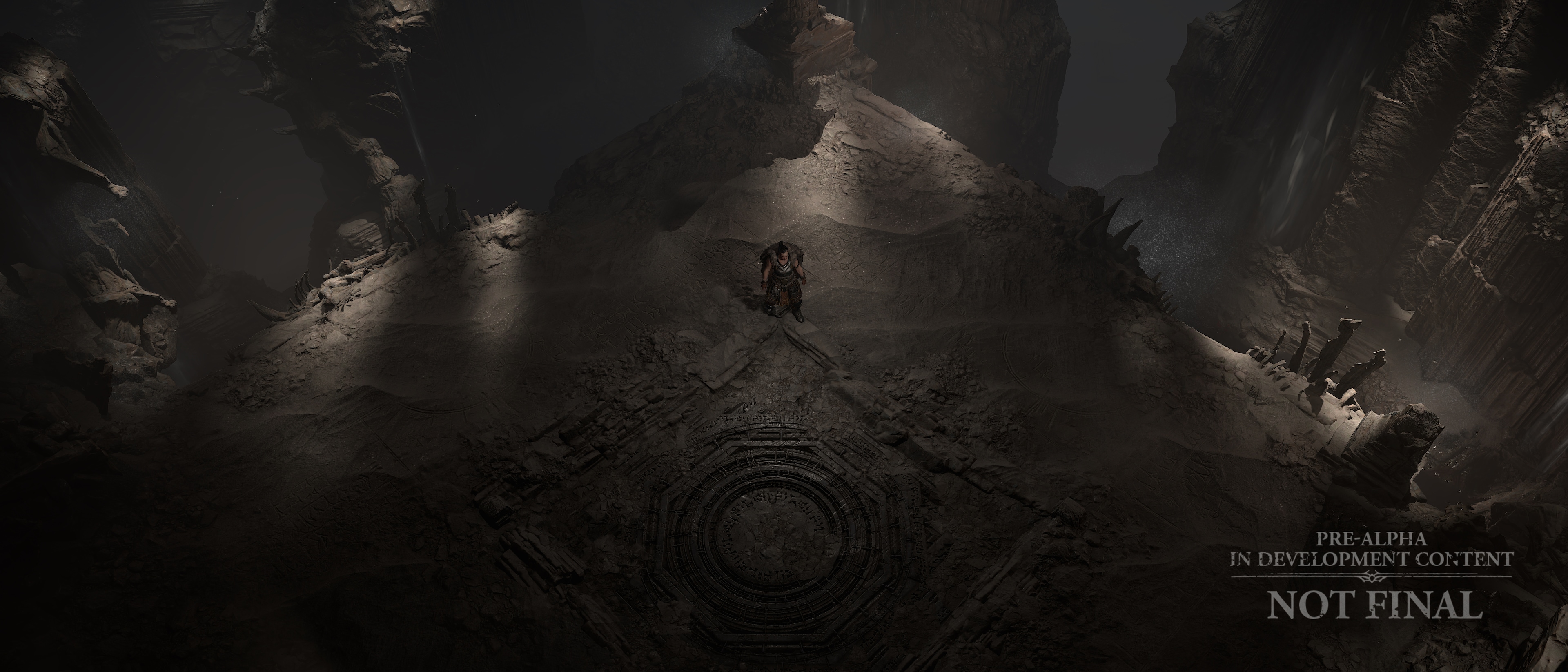
Brian Fletcher: This tile-set is an example of how we have ‘returned to darkness.’ We want to take you deep underground to the darkest recesses of Sanctuary, where a mysterious (and gross) corruption has taken root. This ancient temple is a great place to push some primal horror vibes. The fixed camera is one of our best tools since it allows us to place assets in the foreground without blocking the playable space. Because we always know where you are looking, we can dial in and customize the layouts, vistas, and foreground elements to make sure there’s a good composition. The spider legs are placed in specific locations for their unnerving silhouettes twitching in the background. Our dungeon design counterparts give us some great layouts to play with, which allow us to push the depth of each scene. We want you to have the impression that the dungeon goes on forever, and you’re only seeing a small part of a large underground labyrinth.
Chaz Head: The props and interactives team seek to maintain the mystique and horror settings Brian described. Our hope for this culture kit is to make you feel uneasy whilst being rewarded for venturing forward. Nothing here should feel like it was crafted in Sanctuary by the people living on the surface. We were able to focus on different styles of shape language: monolithic and twisted. This is not a place you would want to explore alone!
Ben Hutchings: Here we can really see our embrace of Diablo 4’s core pillar of a return to darkness’. Our aim is to subtly lead you through the dungeon whilst revealing fantastically grotesque forms. In dungeons like this we focus a lot on silhouetting the player space and giving the scene a sense of scale and depth; this helps navigation and visibility but also shows the vastness of the environment.
Wretched Caves
Brian Fletcher: The world of Diablo IV is incredibly large, utilizing numerous unique tile-sets to cover all the various zones, biomes, and cultures. In order to create so much high-quality content, we found clever ways to reuse our tile-sets and add enough variety to cover 150+ dungeons. All while providing fresh experiences each time. One way we can do that is by dressing up tile-sets with various themes. This next dungeon is a hidden druid resting site overrun with demons. As you travel through the dungeon, you’ll see that it is covered with many druidic cultural items, such as talismans and charms. We place a lot of these items on a layer that can be turned on or off, depending on what the theme of the dungeon is. In one dungeon it’s a druid burial site, in another, it’s an uninhabited dark cave. Adding these sorts of details is a great way to add a lot of visual interest as well as visual storytelling. These assets were made by several teams, so this is a great example of many groups coming together to contribute to a final environment.
Chaz Head: We were able to expand on the Druid culture kit in this dungeon. In many ways the druid is an exciting return to the Diablo franchise, no less for Props and Interactives, expanding on this unique class by providing a full kit for its reclusive people. It would be easy to make the druid props fantastic, but we’ve stretched ourselves to come up with fun ways to keep the culture kit grounded while not turning the druids into something they are not. I hope when you play Diablo IV, you get a sense of their magic while not betraying the dark and gritty world the druids reside in.
Flooded Depths
Brian Fletcher: New dungeon features such as seamless floor transitions or traversals are exciting, but my favorite new feature is what we call tile-set transition scenes. These are scenes that allow us to connect two different tile-sets together in the same dungeon. Imagine running through a crypt, only to find a hole in the wall that seamlessly leads you deeper into a vast underground cave network. All while keeping the randomized layouts that change with each dungeon run. In this final video we show two tile-sets joined together by a tile-set transition scene. The first floor of this ruined keep remains dry and fairly intact, but as you journey deeper into the dungeon, you’ll discover that the lower levels have decayed from the endless floodwaters pouring in. This swampy ruin is perfect for the drowned to move in and fortify themselves deep below. You’ll have to fight your way through their defenses and climb across the rope to transition deeper into the flooded ruined tile-set.
Chaz Head: I love this dungeon; it was one our first where we dialed in the style for props and interactives in Diablo IV. On the surface we have that definitive gothic medieval style fans love. Pikes, suits of armor and iron chandeliers. I hope this set reminds you of what Diablo means to so many of us. Part of that vision is the sense of danger of exploration; as you dig deeper things get gritty. As you descend you will encounter obstacles seemingly out of place. The drowned have invaded this ancient manor and dragged their obscene valuables across the floors. This gives us the opportunity to mix kits, and I hope you agree the mold encrusted assets are gross. Things should feel familiar but tainted by the sodden hands of the drowned hordes.
Ben Hutchings: It’s exciting to be able to merge two distinct visual styles. Here we see the dark, foreboding hallways of the keep lead down into the putrid aqua tones of its depths.
In both we can see the same approach to lighting these dungeons, with different executions. The keep has an oppressively dark, very selective lighting scheme – hinting at paths through the corridors subtly with soft lighting. ”By contrast, the flooded depths use putrid green and yellow tones to really give the dungeon a feeling of a damp, heavy atmosphere.
That was a quick overview of how we approach the environment art of Diablo IV. We love creating the stage for all the action while still delivering subtle visual cues that make Diablo games so iconic. Lastly, it’s not too often that we get to share and appreciate the incredible work of our teammates and the progress of Diablo IV. We’re glad you stopped by for a look and hope you are excited by what you see.
Thank you for joining us and keep an eye out for our upcoming blog update next quarter!
-The Diablo IV Team

